
Geospatial data analysis in #rstats. Part 1
Keywords: kriging, geostatistics, ArcGIS, R, soil science
Many (many) years ago after graduating from undergrad I was introduced to geographical information systems (GIS) at the time, ArcInfo developed by ESRI was the leading software to develop, visualize and analyse geospatial data (and generally still is). I quickly took to learning the “ins” and “outs” of this software burrowing and begging for licenses to feed my desire to learn GIS. Eventually I moved onto my masters degree where I was able to apply a lot of what I learned. Throughout my career I have had an ESRI icon on my desktop. But it wasn’t until I started to learn R that I began to see some of the downfalls of the this iconic software. Yes, ArcGIS and its cousins (GRASS and QGIS) are valuable, powerful and irreplaceable analytical tools…no question. Something you learn with R is reproducibility and easily tracking what you have done. In spreadsheets (i.e. excel) it tough to find out what cells are calculated and how, in R its all in front of you. In ArcGIS there are countless steps (and clicks) to read in data, project, transform, clip, interpolate, reformat, export, plot, extract data etc. Unless you are a python wizard, most of this is reliant on your ability to remember/document the steps necessary to go from raw data to final product in ArcGIS. Reproducibility in data analysis is essential which is why I turned to conducting geospatial analyses in R. Additionally, typing and executing commands in the R console, in many cases is faster and more efficient than pointing-and-clicking around the graphical user interface (GUI) of a desktop GIS.
Thankfully, the R community has contributed tremendously to expand R’s ability to conduct spatial analyses by integrating tools from geography, geoinformatics, geocomputation and spatial statistics. R’s wide range of spatial capabilities would never have evolved without people willing to share what they were creating or adapting (Lovelace et al 2019). There are countless other books r-connect pages, blogs, white papers, etc. dedicated to analyzing, modeling and visualizing geospatial data. I implore you to explore the web for these resources as this blog post is not the one stop shop for info.
Brass Tacks
Geospatial analysis may sound daunting but I will walk you through reading, writing, plotting and analyzing geospatial data. In a prior blog post I outlined some basic mapping in R using the tmap package. I will continue to use tmap to visualize the data spatially.
Let start by loading the necessary (and some unnecessary) R-packages. If you missing any of the “GIS Libraries” identified below use this script to install them, if a package is already installed it will skip and move to next.
#Libraries
library(plyr)
library(reshape)
library(openxlsx)
library(vegan)
library(goeveg);
library(MASS)

##GIS Libraries
library(sp)
library(rgdal)
library(gstat)
library(raster)
library(spatstat)
library(maptools)
library(rgeos)
library(spdep)
library(spsurvey)

library(tmap)
library(GISTools)
library(rasterVis)
For purposes of this exercise I will be using real stations but fake data randomly generated with an imposed spatial gradient for demonstration purposes.
Reading
To read shapefiles such as ESRI .shp files into R you can use the readOGR function in the rgdal library. Feel free to get familiar with with function by typing ?readOGR into the R console. Every time I read a spatial dataset into R I also check the projection using attributes(sp.data)$proj4string to make sure all my spatial data is in the same project. If necessary re-projection of the data is easy.
sp.dat=readOGR(dsn=".../data path/spatial data",layer="SampleSites")
attributes(sp.data)$proj4string
If you have raw data file, like say from a GPS or a random excel file with lat/longs read in the file like you normally do using read.csv() or openxlsx::read.xlsx() and apply the necessary projection. Here is a great lesson on coordinate reference system with some R-code (link) and some additional information in-case you are unfamiliar with CRS and how it applies.
##       UTMX    UTMY
## 1 541130.5 2813700
## 2 541149.1 2813224proj.data=CRS("+proj=utm +zone=17 +datum=NAD83 +units=m +no_defs +ellps=GRS80 +towgs84=0,0,0")
loc.dat.raw=SpatialPointsDataFrame(coords=loc.dat.raw[,c("UTMX","UTMY")],
data=loc.dat.raw,
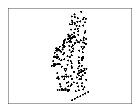
proj4string = proj.data)It always good to take a look at the data spatially before moving forward to ensure the data is correct. You can use the plot function for a quick look at the data.
Interpolations
This section is modeled from Chapter 14 of Gimond (2018).
Proximity (Thessian)
The most basic and simplest interpolation is proximity interpolation, where thiessen polygons are drawn based on the existing monitoring network to approximate all unsampled locations. This process generates a tessellated surface whereby lines that split the midpoint between each sampled location are connected. One obvious issue with this approach is that values can change abruptly between tessellated boundaries and may not accurately represent in-situ conditions.
Despite these downfalls, lets create a thessian polygon and see how the data looks. Using the dirichlet() function, we can create a tessellated surface very easily unfortunately it is not spatially explicit (i.e. doesn’t have a CRS). Also the surface extends beyond the study area, so it will need to be clipped to the extent of the study area (a separate shapefile). R-scripts can be found at this link.
# Generate Thessian polygon and assign CRS
th=as(dirichlet(as.ppp(sp.dat)),"SpatialPolygons")
proj4string(th)=proj4string(sp.dat)

# Join thessian polygon with actual data
th.z=over(th,sp.dat)

# Convert to a spatial polygon
th.spdf=SpatialPolygonsDataFrame(th,th.z)

# Clip to study area
th.clp=raster::intersect(study.area,th.spdf)
## Alternative method
## some have run into issues with dirichlet()
bbox.study.area=bbox(study.area)
bbox.da=c(bbox.study.area[1,1:2],bbox.study.area[2,1:2])
th=dismo::voronoi(sp.dat,ext=bbox.da)
th.z=sp::over(th,sp.dat)
th.z.spdf=sp::SpatialPolygonsDataFrame(th,th.z)
th.clp=raster::intersect(study.area,th.z.spdf)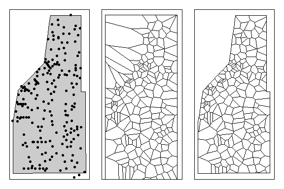
Left: All sampling points within the study area. Middle: Thessian polyon for all sampling locations. Right: Thessian polygons clipped to study area.
As you can see sampling density can significantly affect how the thessian plots an thus representation of the data. Sampling density can also affect other spatial analyses (i.e. spatial auto-correlation) as well.
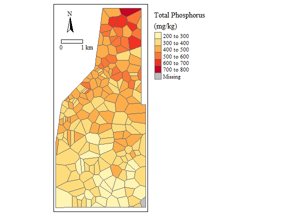
Soil Total Phosphorus concentration (NOT REAL DATA)
Ok, so now you have a spatial estimate of data across your sampling area/study site, now what? We can determine how much of the area is above or below a particular threshold by constructing a cumulative distribution function (cdf) with the data. Using the cont.analysis function in the spsurvey package we can generate the cdf.
# Determine the area for each polygon
#(double check coordinate system, the data is currently in UTM measured in meters)
th.clp$area_sqkm=rgeos::gArea(th.clp,byid=T)*1e-6

#remove any NA's in the data
th.clp= subset(th.clp,is.na(TP_mgkg)==F)

#extracts data frame from the spatial data
cdf.area=data.frame(th.clp@data)

Sites=data.frame(siteID=cdf.area$Site,Use=rep(TRUE, nrow(cdf.area)))
Subpop=data.frame(siteID=cdf.area$Site,Area=cdf.area$area_sqkm)
Design=data.frame(siteID=cdf.area$Site,wgt=cdf.area$area_sqkm)
Data.TP=data.frame(siteID=cdf.area$Site,TP=cdf.area$TP_mgkg)

cdf.estimate=cont.analysis(sites=Sites,
                           design=Design,
                           data.cont=Data.TP,
                           vartype='SRS',
                           pctval = seq(0,100,0.5));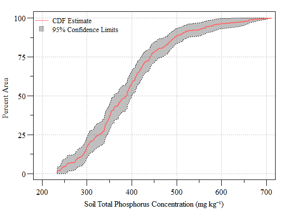
Cumulative distribution function (± 95% CI) of soil total phosphorus concentration (NOT REAL DATA) across the study area
Now we can determine how much area is above/below a particular concentration.
cdf.data=cdf.estimate$CDF

threshold=500; #Soil TP threshold in mg/kg

result=min(subset(cdf.data,Value>500)$Estimate.P)
low.CI=min(subset(cdf.data,Value>500)$LCB95Pct.P)
up.CI=min(subset(cdf.data,Value>500)$UCB95Pct.P)- Using the code above we have determined that approximately 88.8% (Lower 95% CI: 84% and Upper 95% CI: 93.6%) of the study area is equal to or less than 500 mg TP kg-1.
We can also ask at what concentration is 50% of the area?
- Using the code above we can say that 50% of the area is equal to or less than 388 mg TP kg-1.
Kriging
As computer technology has advanced so has the ability to conduct more advance methods of interpolation. A common advanced interpolation technique is Kriging. Generally, kriging typically gives the best linear unbiased prediction of the intermediate values. There are several types of kriging that can be applied such as Ordinary, Simple, Universal, etc which depend on the stochastic properties of the random field and the various degrees of stationary assumed. In the following section I will demonstrate Ordinary Kriging.
Kriging takes generally 4-steps:
Remove any spatial trend in the data (if present).
Compute the experimental variogram, measures of spatial auto-correlation.
Define the experimental variogram model that is best characterized the spatial autcorrelation in the data.
Interpolate the surface using the experimental variogram.
- add the kriged interpolated surface to the trend interpolated surface to produce the final output.
Easy Right?
Actually the steps are very limited, fine tuning (i.e. optimizing) is the hard part.
One major assumption of kriging is that the mean and variation of the data across the study area is constant. This is also referred to as no-global trend or drift. This assumptions is rarely met in environmental data and clearly not met with our data in this study. Therefore the trend in the data needs to be removed. Checking for a spatial trend can be done by plotting the data versus X and Y using plot(Y~Var1,data) and plot(X~Var1,data).
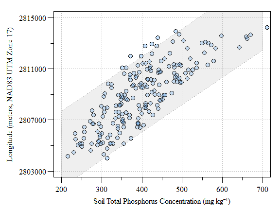
Scatter plot of fake-TP data versus longitude (as meters in UTM) with prediction interval
Detrending the data can be done by fitting a first order model to the data given by: \[Z = a + bX + cY\]
This is what it looks like in R.
#Make grid
grd=as.data.frame(spsample(sp.dat,"regular",n=12000))
names(grd)       = c("UTMX", "UTMY")
coordinates(grd) = c("UTMX", "UTMY")

#grd=spsample(sp.dat,"regular",n=10000)
gridded(grd)=T;fullgrid(grd)=T
proj4string(grd)=proj4string(study.area)
#plot(grd)
#summary(grd)

# Define the 1st order polynomial equation
f.1 = as.formula(TP_mgkg ~ UTMX + UTMY)

# Run the regression model
lm.1 = lm( f.1, data=sp.dat)

# Extract the residual values
sp.dat$res=lm.1$residuals

# Use the regression model output to interpolate the surface
dat.1st = SpatialGridDataFrame(grd, data.frame(var1.pred = predict(lm.1, newdata=grd)))

# Clip the interpolated raster to Texas
r.dat.1st   = raster(dat.1st)
r.m.dat.1st = mask(r.dat.1st, study.area)

# Plot the map
tm_shape(r.m.dat.1st) +
  tm_raster(n=10, palette="RdBu",
            title="First Order Poly \nSoil Total Phosphorus \n(mg kg \u207B\u00B9)") +
  tm_shape(sp.dat) + tm_dots(size=0.2) +
  tm_legend(legend.outside=TRUE)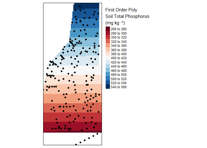
Result of a first order interpolation.
Since the 1st order model uses least squared linear modeling, the assumptions of linear models also applies. You can check to see if the model fits the general assumptions by plot(lm.1) to inspect the residual versus fitted plot, residual distribution and others. You can also use more advanced techniques such as Global Validation of Linear Models by Peña and Slate (2006).
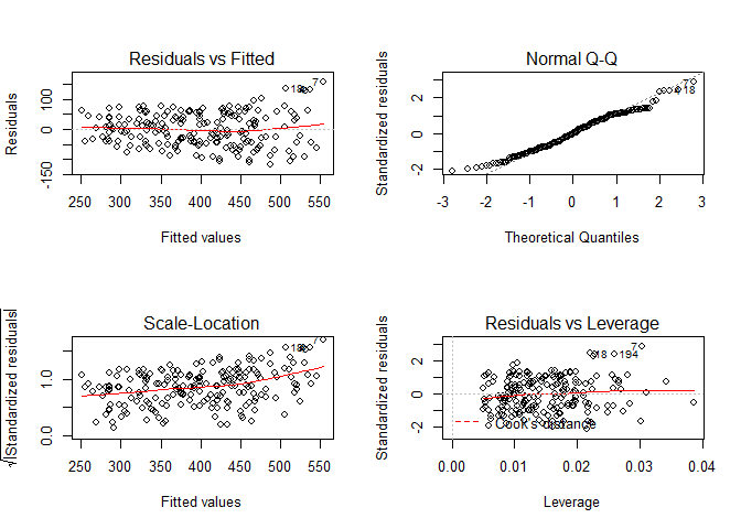
Linear model diagonistic plots
For this example lets assume the model fits all assumptions of least square linear models.
Ultimately Kriging is a spatial analysis of data that focuses on how the data vary as the distance between sampling locations pairing increases. This is done through the construction of a semivariogram and fitting a mathematical model to the resulting variogram. The variability (or difference) of the data between all point pairs is computed as \(\gamma\) as follows:
\[\gamma = \frac{(Z_2-Z_1)^2}{2}\]
Lets compare \(\gamma\) for all point pairs and plot them versus distance between points.
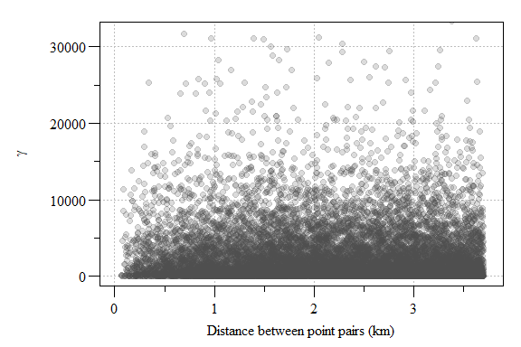
Experimental variogram plot of residual soil total phosphorus values from the 1st order model.
The resulting semivariogram is a cloud of point essentially comparing the variability between all points within the modeling space. If you have a lot of sampling points or a really small area, these semivariogram point clouds can be meaningless given the sheer number of point. In this case, we have 12647 points from 202 sampling locations. To reduce the point-cloud to a more reasonable representation of the data, the data can placed into “bins” or intervals called lags.
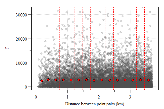
Experimental variogram plot of residual soil total phosphorus values from the 1st order model with lags interval (red hashed lines) and sample variogram estimate each lag (red point) depicted.
Now its time to fit a model to the sample variogram estimate. A slew of models are available in the gstat package, check out the vgm() function. Ultimately the goal is to apply the best fitting model, this is the fine tuning I talked about earlier. Each model uses partial sill, range and nugget parameters to fit the model to the sample variogram estimate. The nugget is distance between zero and the variogram’s model intercept with the y-axis. The partial sill is the vertical distance between the nugget and the curve asymptote. Finally the range is the distance along the x-axis and the partial sill.
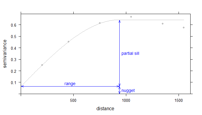
Example of an ideal variogram with fit model depicting the range, sill and nugget parameters in a variogram model (Source Gimond 2018).
In the hypothetical soil total phosphorus (TP) spatial model, the semivariogram is less than ideal. Here I fit a linear model and set the range to zero give the linear nature to the data. You see how this variogram differs from the example above where the model (red line) doesn’t fit the data (blue points) very well. This is where the “rubber meet the road” with Kriging and model fitting to produce a strong spatial model. Additional information regarding the spatial structure of the dataset can be gleaned from the sample variogram estimate. Maybe we will save that for another time?
#sampled variogram estimate
var.smpl  = variogram(res ~ 1, sp.dat, cloud = F)

# Compute the variogram model by passing the nugget, sill and range values
# to fit.variogram() via the vgm() function.
var.fit  = fit.variogram(var.smpl,vgm(model="Lin",range=0))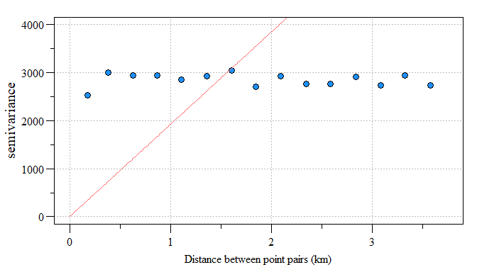
Linear model fit to residual variogram
Like I said, not the best model but for the sake of the work-flow, lets assume the model fit the sampled variogram estimates like the example above from Gimond (2018).
Now that the variogram model has been estimated we can move onto Kriging. The variogram model provides localized weighted parameters to interpolate values across space. Ultimately, Kriging is letting the localized pattern produced by the sample points define the spatial weights.
# Perform the krige interpolation (note the use of the variogram model
# created in the earlier step)
res.dat.krg = krige( res~1, sp.dat, grd, var.fit)

#Convert surface to a raster
res.r=raster(res.dat.krg)

#clip raster to study area
res.r.m=mask(res.r,study.area)

# Plot the raster and the sampled points
tm_shape(res.r.m) +
  tm_raster(n=10, palette="RdBu",
            title="Predicted residual\nSoil Total Phosphorus \n(mg kg \u207B\u00B9)",midpoint = NA,breaks=c(seq(-160,0,80),seq(0,160,80))) +
  tm_shape(sp.dat) + tm_dots(size=0.2) +
  tm_legend(legend.outside=TRUE)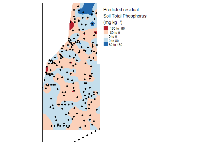
Krige interpolation of the residual (fake) soil total phosphorus values across the study area.
As you can see some areas are under or over estimating soil total phosphorus concentrations. Depending on the resolution of the data and the method detection limit these might be significant over or under representation of the data. Its up to you to decide the validity of the spatial model relative to variogram model fit and the data utilized. Remember the main assumption of kriging is “…that the mean and variation of the data across the study area is constant…” therefore we detrended the data by fitting a first order model (hence the residuals above).
# Define the 1st order polynomial equation (same as eailer)
f.1 = as.formula(TP_mgkg ~ UTMX + UTMY)

#sampled variogram estimate
var.smpl  = variogram(f.1, sp.dat, cloud = F)

# Compute the variogram model by passing the nugget, sill and range values
# to fit.variogram() via the vgm() function.
var.fit  = fit.variogram(var.smpl,vgm(model="Lin",range=0))

# Perform the krige interpolation using 1st order model.
dat.krg <- krige(f.1, sp.dat, grd, var.fit)

# Convert kriged surface to a raster object
data.r <- raster(dat.krg)
data.r.m <- mask(data.r, study.area)

# Plot the map
tm_shape(data.r.m) +
  tm_raster(n=10, palette="RdBu",
            title="Soil Total Phosphorus \n(mg kg \u207B\u00B9)",
              breaks=seq(200,700,50)) +
  tm_shape(sp.dat) + tm_dots(size=0.2) +
  tm_legend(legend.outside=TRUE)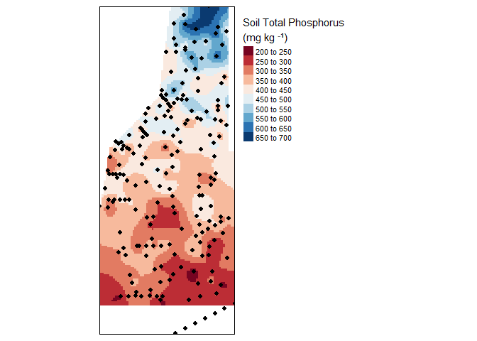
Final kriged interpolation of the detrended (fake) soil total phosphorus values across the study area.
Now that a spatial model has been developed, much like the the CDF analysis using the thessian spatial weighted data. A percentage of area by concentration can be estimated, but we might have to save that for another post.
In addition to the residual map, a variance map is also helpful to provide a measure of uncertainty in the interpolated values. Generally smaller the variance the better the model fits (Note: the variance values are in square units).
# The dat.krg object stores not just the interpolated values, but the
# variance values as well.

var.r <- raster(dat.krg, layer="var1.var")
var.r.m <- mask(var.r, study.area)

#Plot the map
tm_shape(var.r.m) +
  tm_raster(n=7, palette ="Reds",
            title="Variance map \n(in squared meters)") +
  tm_shape(sp.dat) + tm_dots(size=0.2) +
  tm_legend(legend.outside=TRUE)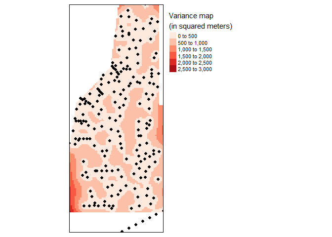
Variance map of final kriged interpolation of the detrended (fake) soil total phosphorus values across the study area.
With units in area units, the variance map is less easily interpreted other than high-versus-low. A more readily interpretable map is the 95% confidence interval map which can be calculated from the variance data stored in dat.krg. Both maps provide an estimate of uncertainty in the spatial distribution of the data.
r.ci   <- sqrt(raster(dat.krg, layer="var1.var")) * 1.96
r.m.ci <- mask(r.ci, study.area)

#Plot the map
tm_shape(r.m.ci) +
  tm_raster(n=7, palette ="Blues",
            title="95% CI map \n(in meters)") +
  tm_shape(sp.dat) +  tm_dots(size=0.2) +
  tm_legend(legend.outside=TRUE)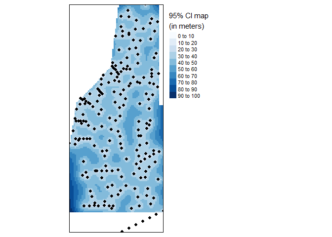
95% Confidence Interval map of final kriged interpolation of the detrended (fake) soil total phosphorus values across the study area.
I hope that this post has provided a better appreciation of spatial interpolation and spatial analysis in R. This is by no means a comprehensive workflow of spatial interpolation and lots of factors need to be considered during this type of analysis.
In the future I will cover spatial statistics (i.e. auto-correlation), other interpolation methods, working with array oriented spatial data (i.e. NetCDF) and others.
Now go forth and interpolate.
References
Gimond M (2018) Intro to GIS and Spatial Analysis.
Lovelace R, Nowosad J, Muenchow J (2019) Geocomputation with R, 1st edn. CRC Press, Boca Raton, FL
Peña EA, Slate EH (2006) Global Validation of Linear Model Assumptions. Journal of the American Statistical Association 101:341–354.