
Geospatial data analysis in #rstats. Part 2
Keywords: geostatistics, R, autocorrelation, Moran, soil science
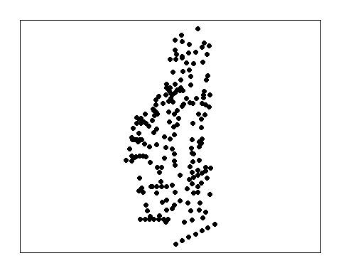
Continuing our series on geospatial analysis we are doing to dive into spatial statistics expanding analyses of spatial patterns. In my prior post I presented spatial interpolation techniques including kriging. Just like in the last post I will be using tmap to display our geospatial data. Also like in the last post I will be using a “fake” dataset from real stations with a randomly generated imposed spatial gradient for demonstration purposes.
First lets load the necessary R-packages/libraries.
# Libraries
library(sp)
library(rgdal)
library(rgeos)
library(maptools)
library(raster)
library(spdep)
library(spatstat)
library(tmap)
library(tmaptools)
Here is our data from the prior post…remember?
Average Nearest-Neighbor
An average nearest neighbor (ANN) analysis measures the average distance from each point in the study area to its nearest point. Average nearest neighbor is exactly what is says it is, the average distance between points (or neighbors) the ultimate analysis involves determining a matrix of distances between points. When plotting ANN as a function of neighbor order it provides some insight into the spatial structure of the data (Gimond 2018).
Here we have three examples a single cluster, dual cluster and a randomly scattering of points.
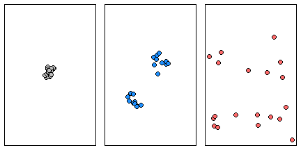
Three different point patterns: a single cluster (left), a dual cluster (center) and a randomly scattered pattern (right).
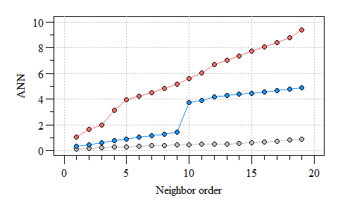
Three different ANN vs. neighbor order plots. The black ANN line is for the first point pattern (single cluster); the blue line is for the second point pattern (double cluster) and the red line is for the third point pattern.
As you can see the more clustered the points the consistent the distance between neighbors. As points become more dispersed, the distances vary from neighbor-to-neighbor, the abrupt change in ANN observed in the clustered points is an indicator of groups/clusters of points and the gradual increase in ANN indicates more-or-less random distribution of points.
What does the ANN network look like for our data? Remember our thessian polygon of the monitoring network from the last post?
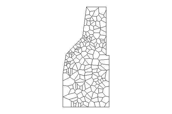
Thessian polygons clipped to study area.
#th.dat is the thessian polygons above.
w=poly2nb(th.dat, row.names=th.dat$Site);#construct the neighbours list.

par(mar=rep(0.5,4),oma=rep(0,4));
plot(th.dat)
plot(w,coordinates(th.dat), col='red', lwd=0.5,add=T)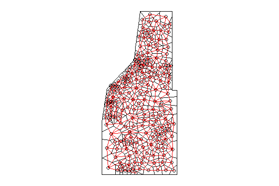
Thessian polygons clipped to the study area with neighborhood network.
The poly2nb() function builds a neighbors list based on regions with a contiguous boundary that is sharing one or more boundary point. However, this same concept can be applied for points as well. Much like the poly2nb() function builds the neighbors list, the knearneigh() function also builds a list using a specified number of neighbors to consider (i.e k). As k increases (i.e. data points), more neighbors are considered and thereby influencing the estimated mean distance between nearest neighbors. As a demonstration here is what the network looks like with only six neighbors considered.
#th.dat is the thessian polygons above.

w2=knn2nb(knearneigh(sp.dat,k=6))
w2=nb2listw(w2)

par(mar=rep(0.5,4),oma=rep(0,4));
plot(w2,coordinates(sp.dat),col="red")
plot(study.area,add=T)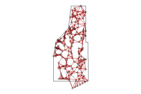
Thessian polygons clipped to the study area with neighborhood network.
As you can see the point-based ANN with only six neighbors considered results in a different network. But what affect does the k number have on ANN?
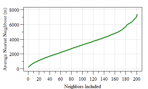
Average Nearest Neighbour as a function of neighbor included.
Selection of a K value can also be corrected for various edge corrections, some of you may be heard of Ripley’s K-function (Ripley 1977). For purposes of this post we will not delve into this aspect of spatial analysis however if your interested and eager to learn Gimond (2018) introduces some of these concepts in detail.
For purposes of this post we are going with a very simple neighbor list (i.e. w variable above) using the thessian polygons to estimate a spatial weight within the network. This neighbor list comes into play in a little bit. Maybe we can dig into the Ripley’s K-function in a future post.
Spatial Autocorrelation
Most if not all field data can be characterized as spatial data, especially in ecology. If something is sampled at a particular location there is a spatial component to the data. As such there are some spatial specific statistics that be applied to spatial data to explain how the data relates to the world. One such statistic is spatial autocorrelation.
Spatial autocorrelation measures the degree to which a phenomenon of interest is correlated to itself in space. This statistical analysis evaluates whether the observed value of a variable at one location is independent of values of that variability at neighboring locations.
Positive spatial autocorrelation indicates similar values appear close to each other (i.e. clustered in space).
Negative spatial autocorrelation indicates that neighboring values are dissimilar (i.e. dispersed in space).
No spatial autocorrelation indicates that the spatial pattern is completely random.
Moran’s I is the most common spatial autocorrelation test however other tests are available (i.e. Geary’s C, Join-Count, etc.) each have a specific application much like the different correlation analyses (i.e. Pearson’s, Spearman, Kendall, etc.). Moreover the spatial autocorrelation analysis of spatial data is relatively straight forward.
Spatial analyses can be expressed in a “Global” or “Local” context. Spatial autocorrelation is no different. Global spatial analysis evaluates the data across the entire dataset (i.e. study area) and assumes homogeneity across the dataset. If the data is spatially heterogeneous or also referred to as inhomogeneous local analyses can be applied. For instance if no global spatial autocorrelation is detected autocorrelation can be tested at the local (i.e. individual spatial units). Moran’s I uses local indicators of spatial association to evaluate data at the local and global levels where the global analysis is the sum of local I values.
Gimond (2018) and Baddeley (2008) provides an excellent step-by-step tutorial on point pattern analysis, the basis of spatial homogeneity. I highly recommend taking a look!!
Moran’s I can be calculated long-hand or using the spdep r-package.
Local Moran’s I spatial autocorrelation statistic (\(I_i\)), also sometimes referred to as Anselin Local Moran’s I (Anselin 1995) and is calculated by:
\[ I_{i} = \frac{n}{\sum_{i=1}^n (y_i - \bar{y})^2} \times \frac{\sum_{i=1}^n \sum_{j=1}^n w_{ij}(y_i - \bar{y})(y_j - \bar{y})}{\sum_{i=1}^n \sum_{j=1}^n w_{ij}} \] Where \(y_{i}\) is the attribute feature (i.e. soil total phosphorus in our case), \(\bar{y}\) is the arithmetic mean across the entire study area/spatial unit, \(w_{ij}\) is the spatial weight between \(i\) and \(j\) and \(n\) is the total number of features.
As alluded to early in addition to a local statistic we also have a Global metric. Global Moran’s I is merely the sum of the local values divided by the total number of features (\(n\))
\[I = \sum_{i=1} \frac{I_{i}}{n} \]
As introduced above, if the Moran’s I statistic is positive indicates that a feature has neighboring features with similarly high or low attribute values; this feature is part of a cluster at the local level. Alternatively if the Moran’s I statistic is negative it indicates that a feature has neighboring features with dissimilar values.Moran’s I statistic is a relative metric and therefore a \(z\)score and \(\rho\)-value can also be calculated to determine statistical significance.
Enough talk, lets jump into R!!
Lets first calculate Moran’s I statistic by hand to understand the nuts and bolts of the calculate. I often find this is the best way to fully appreciate and understand the statistic. This code has been adapted from rspatial.org…another fantastic resource well worth bookmarking (HINT!! HINT!!).
wm=nb2mat(w, style='B');#spatial weights matrix

n=length(th.dat$TP_mgkg);# total number of features
y=th.dat$TP_mgkg;# attribute feature
ybar=mean(th.dat$TP_mgkg);# mean attribute feature across project area
dy=y - ybar;# residual value

yi=rep(dy, each=n);# a list of yi
yj=rep(dy);# a list of yj
yiyj= yi * yj;# cross product of yi and yj

pm=matrix(yiyj,ncol=n);# a matrix of cross products
pmw=pm * wm;# cross products with spatial weights (w value from above)
           # set to zero the value for the pairs that are not adjacent

spmw=sum(pmw,na.rm=T);#
smw=sum(wm); #Sum of spatial weights
sw=spmw / smw

var=n / sum(dy^2);# variance in y

MI=var * sw;# Moran's I
MI
## [1] 0.5790256Now remember the calculated Moran’s I value of 0.579 as we are going to now use the functions in the spdep package to calculate this value and test for significance.
First we need to prep the spatial weights, this time in the form of a list rather than a matrix.
## Characteristics of weights list object:
## Neighbour list object:
## Number of regions: 194
## Number of nonzero links: 1052
## Percentage nonzero weights: 2.795196
## Average number of links: 5.42268
##
## Weights style: B
## Weights constants summary:
##     n    nn   S0   S1    S2
## B 194 37636 1052 2104 24592
Now we can use the moran() function in the spdep package. In this function we plug in the data, number of features (i.e. n) and the global spatial weights \(S_0\) (smw variable in the long hand example above).
## $I
## [1] 0.5790256
##
## $K
## [1] 3.243009
The moran() function provides the Moran’s I value (looks similar to the long hand version right?) and the sample kurtosis (K, not to be confused with the K discussed with ANN). Alright, so now we need to determine if the value is statistically significant. We can go about this in two ways. The first is a parametric evaluation of statistical significance the other is a Monte Carlo simulation. The Monte Carlo approach evaluated the observed value of Moran’s I compared with a simulated distribution to see how likely it is that the observed values could be considered a random draw. Let walk through both shall we.
The parametric approach which uses linear regression based logic and assumptions is pretty straight forward.
##
##  Moran I test under normality
##
## data:  th.dat$TP_mgkg
## weights: ww
##
## Moran I statistic standard deviate = 13.621, p-value < 2.2e-16
## alternative hypothesis: greater
## sample estimates:
## Moran I statistic       Expectation          Variance
##       0.579025628      -0.005181347       0.001839514
The biggest assumption of this analysis is if the data is normally distributed.
##
##  Shapiro-Wilk normality test
##
## data:  th.dat$TP_mgkg
## W = 0.97771, p-value = 0.003475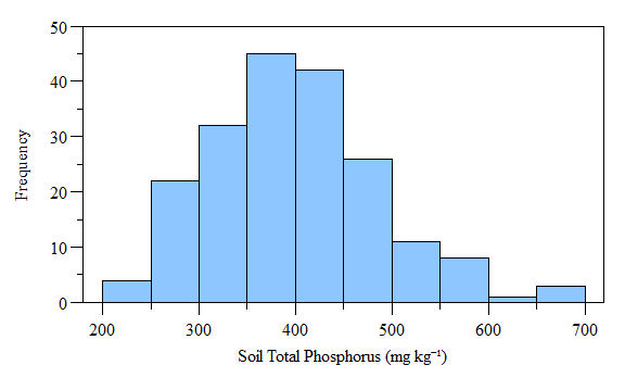
Histogram of (fake) soil total phosphorus concnetrations across the study area.
As you can see the data is not normally distributed, however if the data is log-transformed it becomes normally distributed. Using the moran.test() function with log-transformed data also results in a statistically significant test. Now lets look at the Monte Carlo simulation approach. It is very similar to the above test, except you can specify the number of simulations.
##
##  Monte-Carlo simulation of Moran I
##
## data:  th.dat$TP_mgkg
## weights: ww
## number of simulations + 1: 201
##
## statistic = 0.57903, observed rank = 201, p-value = 0.004975
## alternative hypothesis: greater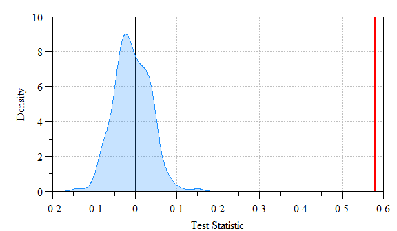
Monte Carlo simulated values versus actual Moran’s I value. Shaded region indicates density of simulated Moran’s I versus the actual value (red-line).
As you can see the actual Moran’s I (i.e. red line) is far outside the simulated data (shaded range) indicating a statistically significantly relationship.
To visualize the spatial autocorrleation in the dataset we can construct a “Moran scatter plot”. This plot displays the spatial data against its spatially lagged values. Much like everything in the R-universe (in a booming voice) “You have the Power…”, as in there are several ways to do something. Below is the most straight forward way I have found to construct a Moran Scatter plot. Also you can identify the data points that have a high influence on the linear relationship between the data and the lag. This plot can easily be done using the moran.plot() function, but learning what goes into the plot helps us appreciate the code behind it…also it allows from customization, think of it as “pimp-my-plot”.
#build a dataframe with scaled and lagged data
scatter.dat=data.frame(SITE=th.dat$Site,
                       sc=scale(th.dat$TP_mgkg),
                       lag_sc=lag.listw(ww,scale(th.dat$TP_mgkg)));
#Linear relationship between scaled and lagged data
xwx.lm=lm(lag_sc ~ sc,scatter.dat)
#Predicted line (and prediction/confidence interval)
xwx.lm.pred=data.frame(x.val=seq(-2,3,0.5),
                       predict(xwx.lm,data.frame(sc=seq(-2,3,0.5)),interval="confidence"))

#Identify data points of high influence.
infl.xwx=influence.measures(xwx.lm)
infl.xwx.pt=which(apply(infl.xwx$is.inf, 1, any))
#scatter.dat[infl.xwx.pt,]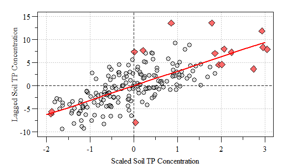
Moran’s Scatter Plot with points of high influence (red-diamonds) and linear relationship (red line) identified.
Based on this global evaluation of the dataset we can conclude that based on the significantly positive Moran’s I value that similar values appear close to each other (i.e. clustered in space). This is where we can dive into the data and evaluate areas of clustering possibly alluding to a hotspot.
Similarly to the global analysis (above) local Moran’s I relays on spatial weights of objects to calculate the test statistic (see equations above).
locali=localmoran(th.dat$TP_mgkg,ww)

#Store test statistic results
th.dat$locali.val=locali[,1]
th.dat$locali.pval=locali[,5]
To identify potential clusters of data we must identify attribute features that are both statistically significant (\(\rho<0.05\)) and positive Moran’s \(I_i\).
th.dat$cluster=with(th.dat@data,
                    as.factor(ifelse(locali.val>0&locali.pval<=0.05,
                                     "Clustered","Not Clustered")))
Now lets look at what we have.
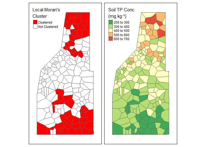
Left: Local Moran’s Clusters as indicated with positive Moran’s \(I_i\) and a \(\rho\) value equal to or less-than 0.05. Right: Soil total phosphorus data (fictious data).
In our (fake) example data we have Here we see two distinct clusters of data (red areas). When we look at the soil TP concentration data we see an area of high concentration to the north and an area of low concentration to the south. Therefore, we can conclude we have two potential clusters of data representing a high and low cluster of values.
Hope this has provided some insight to geospatial statistical analysis.Much like the last blog post, this is by no means a comprehensive workflow of spatial autocorrelation. Other types of spatial autocorrelation analyses are available with each having their own limitation and application. Feel free to explore the world-wide web and don’t be afraid to use ?. Originally I was also going to delve into hot-spot detection using Getis Ord statistics but I think it would be better to reserve that for the next post.
References
Anselin L (1995) Local Indicators of Spatial Association—LISA. Geographical Analysis 27:93–115.
Baddeley A (2008) Analysing spatial point patterns in R. CSIRO. 171.
Gimond M (2018) Intro to GIS and Spatial Analysis.
Ripley BD (1977) Modelling Spatial Patterns. Journal of the Royal Statistical Society: Series B (Methodological) 39:172–192.