
Hot Spot Analysis - Geospatial data analysis in #rstats. Part 3
Keywords: geostatistics, R, hot-spot, Getis-Ord
Continuing our series on geospatial analysis we are diving deeper into spatial statistics Hot-spot analysis. In my prior posts I presented spatial interpolation techniques such as kriging and spatial auto-correlation with Moran’s I.
Kriging is a value tool to detect spatial structure and patterns across a particular area. These spatial models rely on understanding the spatial correction and auto-correlation. A common component of spatial correlation/auto-correlation analyses is they are applied on a global scale (entire dataset). In some cases, it may be warranted to examine patterns at a more local (fine) scale. The Getis-Ord G statistic provides information on local spatial structures and can identify areas of high (or low) clustering. This clustering is operationally defined as hot-spots and is done by comparing the sum in a particular variable within a local neighborhood network relative to the global sum of the area-of-interest extent (Getis and Ord 2010).
Getis and Ord (2010) introduced a family of measures of spatial associated called G statistics. When used with spatial auto-correlation statistics such as Moran’s I, the G family of statistics can expand our understanding of processes that give rise to spatial association, in detecting local hot-spots (in their original paper they used the term “pockets”). The Getis-Ord statistic can be used in the global (\(G\)) and local (\(G_{i}^{*}\)) scales. The global statistic (\(G\)) identifies high or low values across the entire study area (i.e. forest, wetland, city, etc.), meanwhile the local (\(G_{i}^{*}\)) statistic evaluates the data for each feature within the dataset and determining where features with high or low values (“pockets” or hot/cold) cluster spatially.
At this point I would probably throw some equations around and give you the mathematical nitty gritty. Given I am not a maths wiz and Getis and Ord (2010) provides all the detail (lots of nitty and a little gritty) in such an eloquent fashion I’ll leave it up to you if you want to peruse the manuscript. The Getis-Ord statistic has been applied across several different fields including crime analysis, epidemiology and a couple of forays into biogeochemistry and ecology.
Play Time
For this example I will be using a dataset from the United States Environmental Protection Agency (USEPA) as part of the Everglades Regional Environmental Monitoring Program (R-EMAP).
Some on the dataset
The Everglades R-EMAP program has been monitoring the Everglades ecosystem since 1993 in a probability-based sampling approach covering ~5000 km2 from a multi-media aspect (water, sediment, fish, etc.). This large scale sampling has occurred in four phases, Phase I (1995 - 1996), Phase II (1999), Phase III (2005) and Phase IV (2013 - 2014). For the purposes of this post, we will be focusing on sediment/soil total phosphorus concentrations collected during the wet-season sampling during Phase I (April 1995 & May 1996).
Analysis time!!
Here are the necessary packages.
## Libraries
# read xlsx files
library(readxl)

# Geospatial
library(rgdal)
library(rgeos)
library(raster)
library(spdep)
Incase you are not sure if you have these packages installed here is a quick function that will check for the packages and install if needed from CRAN.
# Function
check.packages <- function(pkg){
  new.pkg <- pkg[!(pkg %in% installed.packages()[, "Package"])]
  if (length(new.pkg))
    install.packages(new.pkg, dependencies = TRUE)
  sapply(pkg, require, character.only = TRUE)
}

pkg<-c("openxlsx","readxl","rgdal","rgeos","raster","spdep")
check.packages(pkg)
Download the data (as a zip file) here!
Download the Water Conservation Area shapefile here!
# Define spatial datum
utm17<-CRS("+proj=utm +zone=17 +datum=WGS84 +units=m")
wgs84<-CRS("+proj=longlat +datum=WGS84 +no_defs +ellps=WGS84 +towgs84=0,0,0")
# Read shapefile
wcas<-readOGR(GISdata,"WCAs")
wcas<-spTransform(wcas,utm17)
# Read the spreadsheet
p12<-readxl::read_xls("data/P12join7FINAL.xls",sheet=2)
# Clean up the headers
colnames(p12)<-sapply(strsplit(names(p12),"\\$"),"[",1)
p12<-data.frame(p12)
p12[p12==-9999]<-NA
p12[p12==-3047.6952]<-NA
# Convert the data.frame() to SpatialPointsDataFrame
vars<-c("STA_ID","CYCLE","SUBAREA","DECLONG","DECLAT","DATE","TPSDF")
p12.shp<-SpatialPointsDataFrame(coords=p12[,c("DECLONG","DECLAT")],
data=p12[,vars],proj4string =wgs84)
# transform to UTM (something I like to do...but not necessary)
p12.shp<-spTransform(p12.shp,utm17)
# Subset the data for wet season data only
p12.shp.wca2<-subset(p12.shp,CYCLE%in%c(0,2))
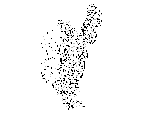
p12.shp.wca2<-p12.shp.wca2[subset(wcas,Name=="WCA 2A"),]Here is a quick map the of data
Much like other spatial statistics (i.e. Moran’s I) the G statistics relies on spatially weighting the data. In my last post we discussed average nearest neighbor (ANN). Average nearest neighbor analysis measures the average distance from each point in the area of interest to it nearest point. As a reminder here is changes in ANN versus the degree of clustering. Here is a quick reminder.
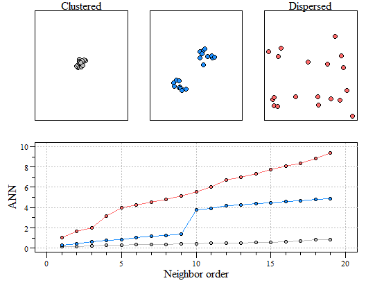
Three different point patterns: a single cluster (top left), a dual cluster (top center) and a randomly scattered pattern (top right). Three different ANN vs. neighbor order plots. The black ANN line is for the first point pattern (single cluster); the blue line is for the second point pattern (double cluster) and the red line is for the third point pattern.
For demonstration purposes we are going to look at a subset of the entire datsaset. We are going to look at data within Water Conservation Area 2A.
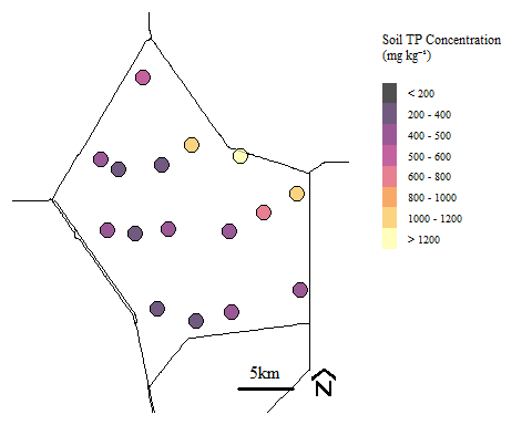
Soil total phosphorus concentration within Water Conservation Area 2A during Phase I sampling.
Most examples of Getis-Ord analysis across the interest looks at polygon type data (i.e. city block, counties, watersheds, etc.). For this example, we are evaluating the data based on point data.
Let’s determine the spatial weight (nearest neighbor distances). Since we are looking at point data, we are going to need to do something slightly different than what was done with Moran’s I in the prior post. The dnearneigh() uses a matrix of point coordinates combined with distance thresholds. To work with the function coordinates will need to be extracted from the data using coordinates(). To find the distance range in the data we can use pointDistance() function. We don’t want to include all possible connections so setting the upper distance bound in the dnearneigh() to the mean distance across the site.
# Find distance range
ptdist=pointDistance(p12.shp.wca2)

min.dist<-min(ptdist); # Minimum
mean.dist<-mean(ptdist); # Mean

nb<-dnearneigh(coordinates(p12.shp.wca2),min.dist,mean.dist)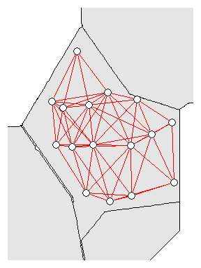
Neighborhood network for WCA-2A sites
Another spatial weights approach could be to apply k-nearest neighbor distances and could be used in the nb2listw(). In general there are minor differences in how these spatial weights are calculated and can be data specific. For purposes of our example we will be using euclidean distance (above) but for completeness below is the k-nearest neighbor approach.
Global G
Now that we have the nearest neighbor values we need to convert the data into a list for both the global and local G statistics. For the global G (globalG.test(...)), it is recommended that the spatial weights be binary, therefore in the nb2listw() function we need to use the style="B".
Now to evaluate the dataset from the Global G statistic.
##
##  Getis-Ord global G statistic
##
## data:  p12.shp.wca2$TPSDF
## weights: nb_lw
##
## standard deviate = 0.092001, p-value = 0.9267
## alternative hypothesis: two.sided
## sample estimates:
## Global G statistic        Expectation           Variance
##         0.48775147         0.48333333         0.00230619
In the output it standard deviate is the standard deviation of Moran’s I or the \(z_{G}\)-score and \(\rho\)-value of the test. Other information in the output include the observed statistic, its expectation and variance.
Based on the Global G results it suggests that there is no high/low clustering globally across the dataset.
If you want more information on the Global test, ESRI provides a robust review including all the additional maths that is behind the statistic.
Local G
Similar to the Global test, the local G test uses nearest neighbors. Unlike the Global test, the nearest neighbor can be row standardized (default setting).
The output of the function is a list of \(z_{G_{i}^{*}}\)-scores for each site. A little extra coding to determine \(\rho\)-values and hot/cold spots. Essentially values need to be extracted from the local_g object and \(\rho\)-value based on the z-score.
# convert to matrix
local_g.ma=as.matrix(local_g)

# column-bind the local_g data
p12.shp.wca2<-cbind(p12.shp.wca2,local_g.ma)

# change the names of the new column
names(p12.shp.wca2)[ncol(p12.shp.wca2)]="localg"
Lets determine the two.side \(\rho\)-value.
Based on the \(z_{G_{i}^{*}}\)-scores and \(\rho\)-value we operationally define a hot-spot as \(z_{G_{i}^{*}}\)-scores > 0 and \(\rho\)-value < \(\alpha\) (usually 0.05). Let see if we have hot-spots.
## [1] "M258"We have one site identified as a hot-spot. Lets maps it out too.
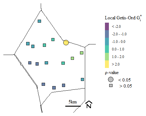
Soil total phosphorus hot-spots identified using the Getis-Ord \(G_{i}^{*}\) spatial statistic.
For context, this soil TP hot-spot occurs near discharge locations into Water Conservation Area 2A. Historically run-off from the upstream agricultural area would be diverted to the area to protection both the agricultural area and the downstream urban areas. Currently restoration activities has eliminated these direct discharge and water quality has improved. However, we still see the legacy affect from past water management. If your interested in how the system is responding check out the South Florida Environmental Report here is last years Everglades Water Quality chapter.
If you would like more background on hot-spot analysis, ESRI produces a pretty good resource on Getis-Ord \(G_{i}^{*}\).
This analysis can also be spatially aggregated (from ESRI) in the R by creating a grid, aggregating the data, estimate the nearest neighbor and evaluating on a local or global scale (maybe we will get to that another time).
Getis, Arthur, and J. K. Ord. 2010. “The Analysis of Spatial Association by Use of Distance Statistics.” Geographical Analysis 24 (3): 189–206. https://doi.org/10.1111/j.1538-4632.1992.tb00261.x.