
PCA basics in #Rstats
Keywords: ordination, R, PCA
The masses have spoken!!

Also I got a wise piece of advice from mikefc regarding R blog posts.

This post was partly motivated by an article by the BioTuring Team regarding PCA. In their article the authors provide the basic concepts behind interpreting a Principal Component Analysis (PCA) plot. Before rehashing PCA plots in R I would like to cover some basics.
Ordination analysis, which PCA is part of, is used to order (or ordinate…hence the name) multivariate data. Ultimately ordination makes new variables called principal axes along which samples are scored and/or ordered (Gotelli and Ellison 2004). There are at least five routinely used ordination analyses, here I intend to cover just PCA. Maybe in the future I cover the other four as it relates to ecological data analysis.
Principal Component Analysis
I have heard PCA call lots of things in my day including but not limiting to magic, statistical hand waving, mass plotting, statistical guesstimate, etc. When you have a multivariate dataset (data with more than one variable) it can be tough to figure out what matters. Think water quality data with a whole suite of nutrients or fish study with biological, habitat and water chemistry data for several sites along a stream/river. PCA is the best way to reduce the dimesionality of multivariate data to determine what statistically and practically matters. But its also beyond a data winnowing technique it can also be used to demonstrate similarity (or difference) between groups and relationships between variables. A major disadvantage of PCA is that it is a data hungry analysis (see assumptions below).
Assumptions of PCA
Finding a single source related to the assumptions of PCA is rare. Below is combination of several sources including seminars, webpages, course notes, etc. Therefore this is not an exhaustive list of all assumptions and I could have missed some. I put this together for my benefit as well as your. Proceed with caution!!
Multiple Variables: This one is obvious. Ideally, given the nature of the analysis, multiple variables are required to perform the analysis. Moreover, variables should be measured at the continuous level, although ordinal variable are frequently used.
Sample adequacy: Much like most (if not all) statistical analyses to produce a reliable result large enough sample sizes are required. Generally a minimum of 150 cases (i.e. rows), or 5 to 10 cases per variable is recommended for PCA analysis. Some have suggested to perform a sampling adequacy analysis such as Kaiser-Meyer-Olkin Measure (KMO) Measure of Sampling Adequacy. However, KMO is less a function of sample size adequacy as its a measure of the suitability of the data for factor analysis, which leads to the next point.
Linearity relationships: It is assumed that the relationships between variables are linearly related. The basis of this assumption is rooted in the fact that PCA is based on Pearson correlation coefficients and therefore the assumptions of Pearson’s correlation also hold true. Generally, this assumption is somewhat relaxed…even though it shouldn’t be…with the use of ordinal data for variable.
The KMOS and bart_spher functions in the REdaS R library can be used to check the measure of sampling adequacy and if the data is different from an identity matrix , below is a quick example.
library(REdaS)
library(vegan)
library(reshape)

data(varechem);#from vegan package

# KMO
KMOS(varechem)
##
## Kaiser-Meyer-Olkin Statistics
##
## Call: KMOS(x = varechem)
##
## Measures of Sampling Adequacy (MSA):
## N P K Ca Mg S Al
## 0.2770880 0.7943090 0.6772451 0.7344827 0.6002924 0.7193302 0.4727618
## Fe Mn Zn Mo Baresoil Humdepth pH
## 0.5066961 0.6029551 0.6554475 0.4362350 0.7007942 0.5760349 0.4855293
##
## KMO-Criterion: 0.6119355## Bartlett's Test of Sphericity
##
## Call: bart_spher(x = varechem)
##
## X2 = 260.217
## df = 91
## p-value < 2.22e-16The varechem dataset appears to be suitable for factor analysis. The KMO value for the entire dataset is 0.61, above the suggested 0.5 threshold. Furthermore, the data is significantly different from an identity matrix (H0 : all off-diagonal correlations are zero).
- No significant outliers: Like most statistical analyses, outliers can skew any analysis/ In PCA, outliers can have a disproportionate influence on the resulting component computation. Since principal components are estimated by essentially re-scaling the data retaining the variance outlier could skew the estimate of each component within a PCA. Another way to visualize how PCA is performed is that it uses rotation of the original axes to derive a new axes, which maximizes the variance in the data set. In 2D this looks like this:
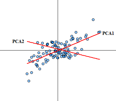
You would expect that if true outliers are present that the newly derived axes will be skewed. Outlier analysis and issues associated with identifying outliers is a whole other ball game that I will not cover here other than saying box-plots are not a suitable outlier identification analysis, see Tukey (1977) for more detail on boxplots (I have a manuscript In Prep focusing on this exact issue).
Terminology
Before moving forward I wanted to dedicate some additional time to some terms specific to component analysis. By now we know the general gist of PCA … incase you were paying attention PCA is essentially a dimensionality reduction or data compression method to understand how multiple variable correlate in a given dataset. Typically when people discuss PCA they also use the terms loading, eigenvectors and eigenvalues.
Eigenvectors are unit-scaled loadings. Mathematically, they are the column sum of squared loadings for a factor. It conceptually represents the amount of variance accounted for by a given factor.
Eigenvalues also called characteristic roots is the measure of variation in the total sample accounted for by each factor. Computationally, a factor’s eigenvalues are determined as the sum of its squared factor loadings for all the variables. The ratio of eigenvalues is the ratio of explanatory importance of the factors with respect to the variables (remember this for later).
Factor Loadings is the correlation between the original variables and the factors. Analogous to Pearson’s r, the squared factor loadings is the percent of variance in that variable explained by the factor (…again remember this for later).
Analysis
Now that we have the basic terminology laid out and we know the general assumptions lets do an example analysis. Since I am an aquatic biogeochemist I am going to use some limnological data. Here we have a subset of long-term monitoring locations from six lakes within south Florida monitored by the South Florida Water Management District (SFWMD). To retrieve the data we will use the AnalystHelper package (link), which has a function to retrieve data from the SFWMD online environmental database DBHYDRO.
Let retrieve and format the data for PCA analysis.
#Libraries/packages needed
library(AnalystHelper)
library(reshape)

#Date Range of data
sdate=as.Date("2005-05-01")
edate=as.Date("2019-05-01")

#Site list with lake name (meta-data)
sites=data.frame(Station.ID=c("LZ40","ISTK2S","E04","D02","B06","A03"),
                 LAKE=c("Okeechobee","Istokpoga","Kissimmee","Hatchineha",
                        "Tohopekaliga","East Tohopekaliga"))

#Water Quality parameters (meta-data)
parameters=data.frame(Test.Number=c(67,20,32,179,112,8,10,23,25,80,18,21),
                      param=c("Alk","NH4","Cl","Chla","Chla","DO","pH",
                              "SRP","TP","TN","NOx","TKN"))

# Retrieve the data
dat=DBHYDRO_WQ(sdate,edate,sites$Station.ID,parameters$Test.Number)

# Merge metadata with dataset
dat=merge(dat,sites,"Station.ID")
dat=merge(dat,parameters,"Test.Number")

# Cross tabulate the data based on parameter name
dat.xtab=cast(dat,Station.ID+LAKE+Date.EST~param,value="HalfMDL",mean)

# Cleaning up/calculating parameters
dat.xtab$TN=with(dat.xtab,TN_Combine(NOx,TKN,TN))
dat.xtab$DIN=with(dat.xtab, NOx+NH4)

# More cleaning of the dataset
vars=c("Alk","Cl","Chla","DO","pH","SRP","TP","TN","DIN")
dat.xtab=dat.xtab[,c("Station.ID","LAKE","Date.EST",vars)]

head(dat.xtab)
## Station.ID LAKE Date.EST Alk Cl Chla DO pH SRP
## 1 A03 East Tohopekaliga 2005-05-17 17 19.7 4.00 7.90 6.10 0.0015
## 2 A03 East Tohopekaliga 2005-06-21 22 15.4 4.70 6.90 6.40 0.0015
## 3 A03 East Tohopekaliga 2005-07-19 16 15.1 5.10 7.10 NaN 0.0015
## 4 A03 East Tohopekaliga 2005-08-16 17 14.0 3.00 6.90 6.30 0.0015
## 5 A03 East Tohopekaliga 2005-08-30 NaN NaN 6.00 7.07 7.44 NaN
## 6 A03 East Tohopekaliga 2005-09-20 17 16.3 0.65 7.30 6.70 0.0010
## TP TN DIN
## 1 0.024 0.710 0.040
## 2 0.024 0.680 0.030
## 3 0.020 0.630 0.020
## 4 0.021 0.550 0.030
## 5 NaN NA NaN
## 6 0.018 0.537 0.017If you are playing the home game with this dataset you’ll notice some NA values, this is because that data was either not collected or removed due to fatal laboratory or field QA/QC. PCA doesn’t work with NA values, unfortunately this means that the whole row needs to be excluded from the analysis.
Lets actually get down to doing a PCA analysis. First off, you have several different flavors (funcations) of PCA to choose from. Each have there own nuisances and come from different packages.
prcomp()andprincomp()are from the basestatspackage. The quickest, easiest and most stable version since its in base.PCA()in theFactoMineRpackage.dubi.pca()in theade4package.acp()in theamappackage.rda()in theveganpackage. More on this later.
Personally, I only have experience working with prcomp, princomp and rda functions for PCA. The information shown here in this post can be extracted or calculated from any of these functions. Some are straight forward others are more sinuous. Above I mentioned using the rda function for PCA analysis. rda() is a function in the vegan R package for redundancy analysis (RDA) and the function I am most familiar with to perform PCA analysis. Redundancy analysis is a technique used to explain a dataset Y using a dataset X. Normally RDA is used for “constrained ordination” (ordination with covariates or predictors). Without predictors, RDA is the same as PCA.
As I mentioned above, NAs are a no go in PCA analysis so lets format/clean the data and we can see how much the data is reduced by the na.omit action.
## [1] 725## [1] 515Also its a good idea as with most data, is to look at your data. Granted when the number of variables get really big…imagine trying to looks at a combination of more than eight or nine parameters. Here we have a scatterplot of water quality data within our six lakes. The parameters in this analysis is Alkalinity (ALK), Chloride (Cl), chlorophyll-a (Chl-a), dissolved oxygen (DO), pH, soluble reactive phosphorus (SRP), total phosphorus (TP), total nitrogen (TN) and dissolved inorganic nitrogen (DIN).
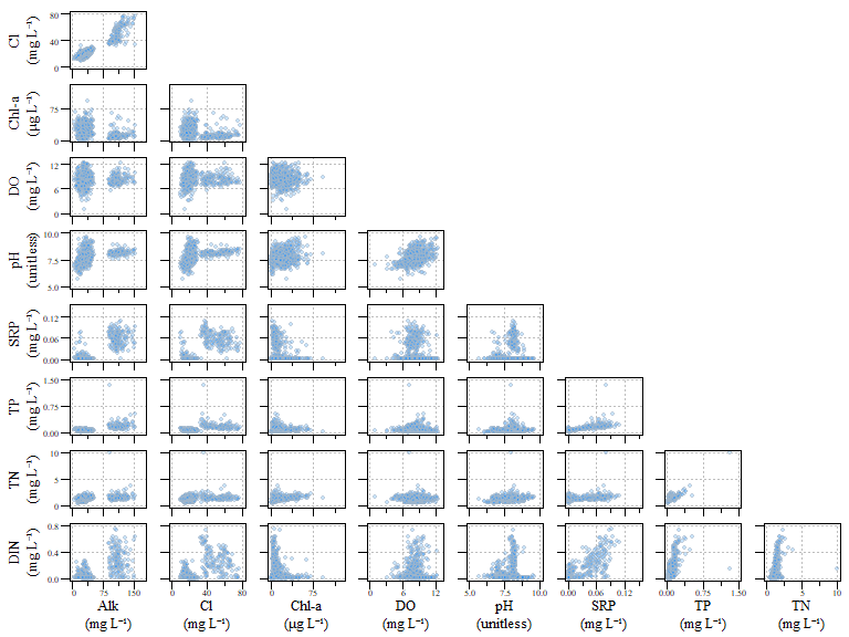
Scatterplot of all data for the example dat.xtab2 dataset.
Alright, now the data is formatted and we have done some general data exploration. Lets check the adequacy of the data for component analysis…remember the KMO analysis?
##
## Kaiser-Meyer-Olkin Statistics
##
## Call: KMOS(x = dat.xtab2[, vars])
##
## Measures of Sampling Adequacy (MSA):
##       Alk        Cl      Chla        DO        pH       SRP        TP
## 0.7274872 0.7238120 0.5096832 0.3118529 0.6392602 0.7777460 0.7524428
##        TN       DIN
## 0.6106997 0.7459682
##
## KMO-Criterion: 0.6972786
Based on the KMO analysis, the KMO-Criterion of the dataset is 0.7, well above the suggested 0.5 threshold.
Lets also check if the data is significantly different from an identity matrix.
##  Bartlett's Test of Sphericity
##
## Call: bart_spher(x = dat.xtab2[, vars])
##
##      X2 = 4616.865
##      df = 36
## p-value < 2.22e-16
Based on Sphericity test (bart_spher()) the results looks good to move forward with a PCA analysis. The actual PCA analysis is pretty straight forward after the data is formatted and “cleaned”.
Before we even begin to plot out the typical PCA plot…try biplot() if your interested. Lets first look at the importance of each component and the variance explained by each component.
#Extract eigenvalues (see definition above)
eig <- dat.xtab2.pca$CA$eig

# Percent of variance explained by each compoinent
variance <- eig*100/sum(eig)

# The cumulative variance of each component (should sum to 1)
cumvar <- cumsum(variance)

# Combine all the data into one data.frame
eig.pca <- data.frame(eig = eig, variance = variance,cumvariance = cumvar)
As with most things in R there are always more than one way to do things. This same information can be extract using the summary(dat.xtab2.pca)$cont.
What does the component eigenvalue and percent variance mean…and what does it tell us. This information helps tell us how much variance is explained by the components. It also helps identify which components should be used moving forward.
Generally there are two general rules:
- Pick components with eignvalues of at least 1.
- This is called the Kaiser rule. A variation of this method has been created where the confidence intervals of each eigenvalue is calculated and only factors which have the entire confidence interval great than 1.0 is retained (Beran and Srivastava 1985, 1987; Larsen and Warne 2010). There is an
Rpackage that can calculate eignvalue confidence intervals through bootstrapping, I’m not going to cover this in this post but below is an example if you wanted to explore it for yourself.
- This is called the Kaiser rule. A variation of this method has been created where the confidence intervals of each eigenvalue is calculated and only factors which have the entire confidence interval great than 1.0 is retained (Beran and Srivastava 1985, 1987; Larsen and Warne 2010). There is an
- The selected components should be able to describe at least 80% of the variance.
If you look at eig.pca you’ll see that based on these criteria component 1, 2 and 3 are the components to focus on as they are enough to describe the data. While looking at the raw numbers are good, nice visualizations are a bonus. A scree plot displays these data and shows how much variation each component captures from the data.
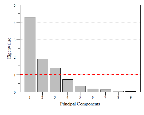
Scree plot of eigenvalues for each prinicipal component of dat.xtab2.pca with the Kaiser threshold identified.
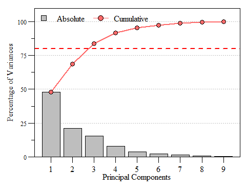
Scree plot of the variance and cumulative variance for each priniciple component from dat.xtab2.pca.
Now that we know which components are important, lets put together our biplot and extract components (if needed). To extract out components and specific loadings we can use the scores() function in the vegan package. It is a generic function to extract scores from vegan oridination objects such as RDA, CCA, etc. This function also seems to work with prcomp and princomp PCA functions in stats package.
scrs is a list of two item, species and sites. Species corresponds to the columns of the data and sites correspond to the rows. Use choices to extract the components you want, in this case we want the first three components. Now we can plot the scores.
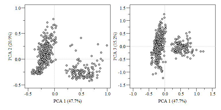
PCA biplot of two component comparisons from the data.xtab2.pca analysis.
Typically when you see a PCA biplot, you also see arrows of each variable. This is commonly called loadings and can interpreted as:
When two vectors are close, forming a small angle, the variables are typically positively correlated.
If two vectors are at an angle 90\(^\circ\) they are typically not correlated.
If two vectors are at a large angle say in the vicinity of 180\(^\circ\) they are typically negatively correlated.
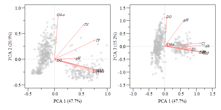
PCA biplot of two component comparisons from the data.xtab2.pca analysis with rescaled loadings.
You can take this one even further with by showing how each lake falls in the ordination space by joining the sites to the original data frame. This is also how you use the derived components for further analysis.
##   Station.ID              LAKE   Date.EST Alk   Cl Chla  DO  pH    SRP
## 1        A03 East Tohopekaliga 2005-05-17  17 19.7 4.00 7.9 6.1 0.0015
## 2        A03 East Tohopekaliga 2005-06-21  22 15.4 4.70 6.9 6.4 0.0015
## 4        A03 East Tohopekaliga 2005-08-16  17 14.0 3.00 6.9 6.3 0.0015
## 6        A03 East Tohopekaliga 2005-09-20  17 16.3 0.65 7.3 6.7 0.0010
## 8        A03 East Tohopekaliga 2005-10-19  15 14.3 2.60 7.8 6.8 0.0010
## 9        A03 East Tohopekaliga 2005-11-15  13 15.8 3.70 8.6 6.7 0.0020
##      TP    TN   DIN        PC1        PC2        PC3
## 1 0.024 0.710 0.040 -0.3901117 -0.2240239 -0.5666993
## 2 0.024 0.680 0.030 -0.3912797 -0.2083258 -0.6284024
## 4 0.021 0.550 0.030 -0.4290627 -0.2486860 -0.6599207
## 6 0.018 0.537 0.017 -0.4045084 -0.2775129 -0.4566961
## 8 0.017 0.454 0.014 -0.4194518 -0.2718903 -0.3418373
## 9 0.010 0.437 0.017 -0.4232014 -0.2807803 -0.2434219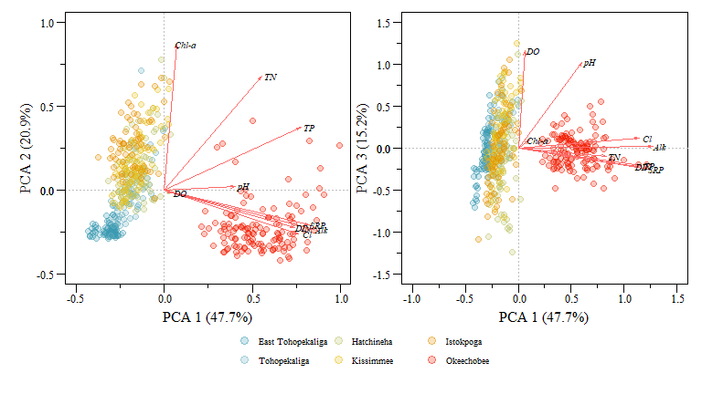
PCA biplot of two component comparisons from the data.xtab2.pca analysis with rescaled loadings and Lakes identified.
You can extract a lot of great information from these plots and the underlying component data but immediately we see how the different lakes are group (i.e. Lake Okeechobee is obviously different than the other lakes) and how differently the lakes are loaded with respect to the different variables. Generally this grouping makes sense especially for the lakes to the left of the plot (i.e. East Tohopekaliga, Tohopekaliga, Hatchineha and Kissimmee), these lakes are connected, similar geomorphology, managed in a similar fashion and generally have similar upstream characteristics with shared watersheds.
I hope this blog post has provided a better appreciation of component analysis in R. This is by no means a comprehensive workflow of component analysis and lots of factors need to be considered during this type of analysis but this only scratches the surface.
References
Beran, Rudolf, and Muni S. Srivastava. 1985. “Bootstrap Tests and Confidence Regions for Functions of a Covariance Matrix.” The Annals of Statistics 13 (1): 95–115. https://doi.org/10.1214/aos/1176346579.
———. 1987. “Correction: Bootstrap Tests and Confidence Regions for Functions of a Covariance Matrix.” The Annals of Statistics 15 (1): 470–71. https://doi.org/10.1214/aos/1176350284.
Gotelli, Nicholas J., and Aaron M. Ellison. 2004. A Primer of Ecological Statistics. Sinauer Associates Publishers.
Larsen, Ross, and Russell T. Warne. 2010. “Estimating Confidence Intervals for Eigenvalues in Exploratory Factor Analysis.” Behavior Research Methods 42 (3): 871–76. https://doi.org/10.3758/BRM.42.3.871.
Tukey, John Wilder. 1977. “Exploratory Data Analysis.” In Statistics and Public Policy, edited by Frederick Mosteller, 1st ed. Addison-Wesley Series in Behavioral Science. Quantitative Methods. Addison-Wesley.